Sunday, 26 December 2010

condom packaging from 1930's/40's

These beautifully designed vintage condom packets just caught my eye. They're actually quite funny in the way that some describe exactly what they are for and some have no description what so ever, and the names well they are just hilarious. I think my favourite is Merry Widows ;)

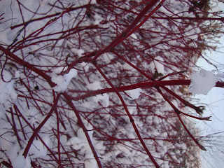
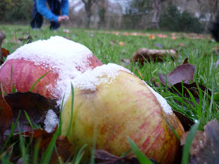
colour walk


I went on a winter walk during christmas for some colour inspiration, i was looking for typical reds and greens and rather than staring at a colour palette and searching through pantone colours i wanted to get out of the house and off the mac into the nature and wildlife of my garden.

Thursday, 2 December 2010

David McCandless: The beauty of data visualization


David McCandless turns complex data sets (like worldwide military spending, media buzz, Facebook status updates) into beautiful, simple diagrams that tease out unseen patterns and connections. Good design, he suggests, is the best way to navigate information glut -- and it may just change the way we see the world.

Jason Fried: Why work doesn't happen at work

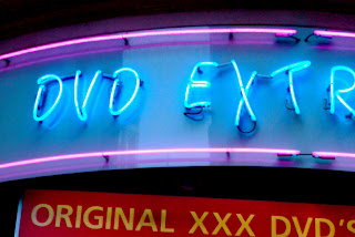
Soho!


Whilst walking around the back streets of Soho i found these seedy neon lights, i took the photos on my phone that's why the quality is poor..i'm not really sure why i like them i think they're interesting and tacky and i love abit of tack!
This kind of reminds me of how the sex industry is and how even though its out of sight it's still going on.

Hayward Gallery- Move; Choreographing you.


This post is a couple of weeks late, but I saw the exhibition guide lying in my draw and thought of how much it inspired me. Not only does it explore the world of dance and making people move but it links in artists that also try to do the same. My favourite exhibition piece was most likely the installation called "The fact of matter by William Forsyth" the challenge was to go from one end of the ballet hoops (about 30ft tall and 10ft wide hanging from ropes of various sizes) to another without touching the floor, this stimulates the mind and makes you aware of your weight and conscious of not falling... VERY HARD. A great piece though, was very funny watching all these artists trying to transform into elegant dancers.

Monday, 15 November 2010

Friday, 4 June 2010

BFI - too hot to draw

all i can think about is wishing i had this ice cream right now....
I really like these old images and i'm going to include them into my work and home fully recreate some :)
but at the moment it's too hot to think.......

Design a dictionary!


I have chosen to design my dictionary on shapes.

Tuesday, 2 March 2010

What i have been working on this morning...


I have been working on a montage of the female form... i would like to screenprint this once it's finished... keep you updated on the progress.

Thursday, 25 February 2010

Just a quick sketch!

Unknown Land (Group Project)

This one would be a potential flag, using the hands as a logo.


These are some poster ideas for our "recycled world" i began looking at the old war posters which really inspired me.

Wednesday, 24 February 2010

1 Week Group Project -ALEX REUBEN- One minute Film

Our Brief: To produce a 1 minute film with no edits. This is what we came up with... a film showing only hand movements but consisting of 4 Languages all describing the Iphone.. we choreographed the film to look like it was cutting from each person.
The improvements to this Film, if we had more time would be to put the Phone upto the screen so the audience could see the person answering it, instead of Lizzie being in shot for longer.

Weston Pier Destroyed by Inferno EXHIBITION


Today i set up an Exhibition for the Magical Museum Brief it turned out well and i'm pleased with it...
Images of before, during and after the Grand pier fire, using Bright Happy colours to contrast with the sadness and memories which were lost within the tragedy.

Colours! Colours! COLOURS!

All i can think about is Pantone colours! trying to decide what colour theme to go with... can't decide!

Letterpress!

Today i have been busy in letterpress laying out the Exhibition poster for 'Magical Museum' it took all day to layout as i have used about 4 different point sizes and rules, using both wooden type and metal.
I wanted the poster to look like a newspaper headline and chose "weston pier destroyed by inferno" as the exhibition name.

Weston Pier Exhibition (Magical Museum Brief)


For the Christmas holidays, we were given a project entitled ‘Magical Museum’. We had to research an exhibit at our local museum that fascinated us and create an alternate exhibit for a joint 1st and 2nd year exhibition. I chose the Fire of Weston-Super-Mare's Grand Pier in 2007, as this seemed to be the main focus of the museum and interested me the most. I would like to recreate some billboard posters for the rebuild of the new pier to make it seem less of a destruction.. i want to use happy colours to contrast with the loss of all the happy memories many people had. I would like to use both Large format Digital print, Letterpress and Screen print.